Whether you're designing an interface for an ecommerce store, an appointment booking, or any other website that requires users to fill out their personal information like a phone number, you have to put extra effort into it. Don't make your users wonder which phone number format is correct or go through a lengthy validation process to guess the valid format. If something like this happens, that means your phone number fields aren't properly designed. In this article, we've gathered several essential tips for creating error-proof phone number fields, so read on.

1. Use Input Masks
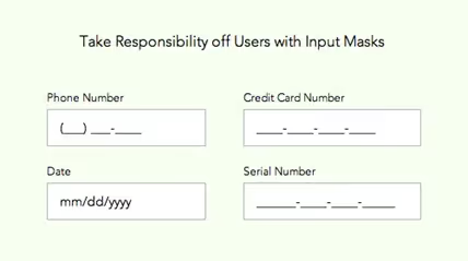
A Baymard Institute study reveals that 89% of users enter phone number data in a different format, even if there is a hint in the field. Use input masks to make your users submit the data in the correct format. They indicate the data format that must be entered, including the number of characters, restricted characters, etc.
Input masks combined with auto-formatting and geolocation are the easiest way to enter the phone number. If you're dealing with global users, automatic geolocation will detect their country, giving them a hint that they're on the right path. Meanwhile, auto-formatting will arrange the data, so users don't need to enter symbols like brackets and dashes.

2. Indicate Geolocation
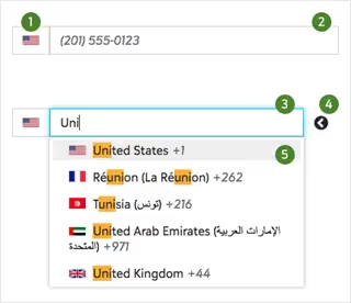
Ideally, when a user fills out the form, their geolocation is automatically detected once they input the country code. A common solution is to display the flag of the country next to the phone number, so users can quickly spot their location and receive an instant confirmation of their data entry. Alternatively, allow users to enter the country name and find their country code faster.

You can also use autocomplete forms. For example, when users enter a single digit, they have city code options with a country flag. Don't forget about peculiarities of each country, for example, states in the USA.
3. Don’t Rush With Data Validation
Don't annoy users with fast data validation. Allow them to enter the phone number and display the data validation result: confirmed or failed. A too fast data validation misguides users: they might think they've been unable to complete the data entry process. Also, mistake alerts frustrate users and deteriorate their experience.
Some websites show errors after users have completely filled out the form and pressed the "Continue" button while others use contextual checking and display an error message directly after filling out the field or even earlier. There's no right or wrong solution – pick yours!

4. Avoid Multiple Cells for the Phone Number Input
The usage of multiple cells could prevent your users from wrong data input. However, it's not an ideal solution since it doesn't allow users to paste the copied phone number correctly. In the case with multiple cells, the copied information will be added to the first cell, and users will be forced to copy the number in chunks to paste them into each cell.
Moreover, multiple cells aren't mobile-friendly, and users must double their effort to correct the data in case of wrong input.
5. Guide Users
The rule of thumb is to simplify the process of filling out the fields and help users quickly fix their errors. Without little guidance, they won't be able to understand what's needed from them quickly. Use these tips to enhance user experience:
- Display a status if the field is filled in correctly or not. For example, you can use icons like a green checkmark to indicate the correct status.
- Display the number of characters to fill out.
- Automatically arrange a phone number into chunks right after a user fills out the form.

Heading 1
Heading 2
Heading 3
Heading 4
Heading 5
Heading 6
Lorem ipsum dolor sit amet, consectetur adipiscing elit, sed do eiusmod tempor incididunt ut labore et dolore magna aliqua. Ut enim ad minim veniam, quis nostrud exercitation ullamco laboris nisi ut aliquip ex ea commodo consequat. Duis aute irure dolor in reprehenderit in voluptate velit esse cillum dolore eu fugiat nulla pariatur.
Block quote
Ordered list
- Item 1
- Item 2
- Item 3
Unordered list
- Item A
- Item B
- Item C
Bold text
Emphasis
Superscript
Subscript


