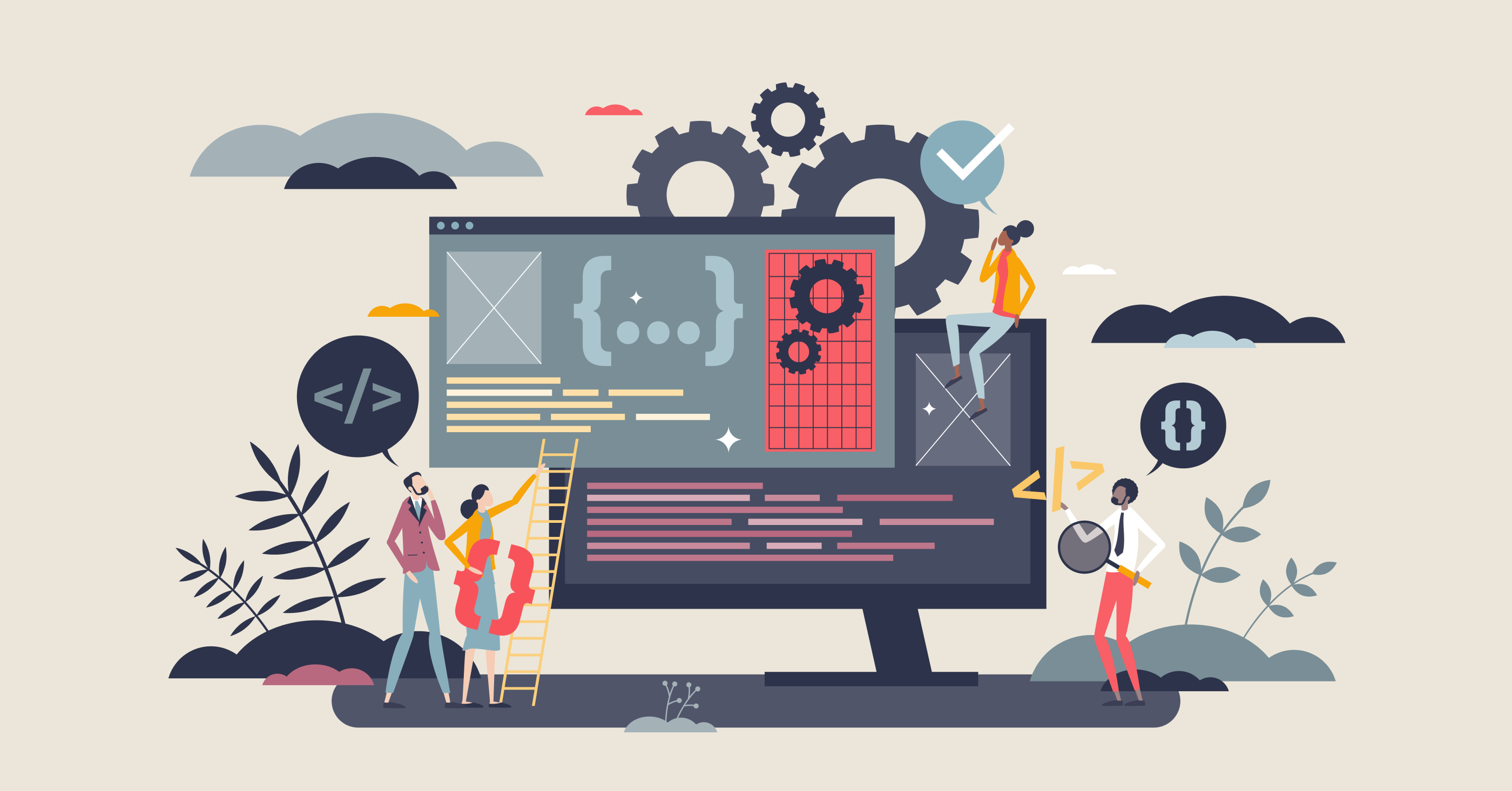
As a newbie in UI/UX design, you might get lost in the sea of deliverables you have to produce at each stage of software design. Keep on reading! In this article, we decided to sort out all the tricky questions from the ground up.
.avif)
Research
Depending on the product development stage (whether it's a brand new software product or the existing one that needs revamping), UI/UX designers conduct different kinds of research. For example, for a product from scratch, you're likely to research competitors, elicit business needs, and study potential users. To catch up with design of existing products, UI/UX designers conduct the UX audit, study business models, and analyze metrics to discover any bottlenecks and find room for improvement.
1. User persona
A persona represents an archetype that represents a certain behavioral model. Simply put, it's a description of a group of users with unique expectations, experiences, experiences, and pain points in one fictitious profile. It's very similar to a marketing persona that embodies a fictional character to relate to during creating marketing campaigns.
2. Customer journey map
A customer journey map (CJM) visualizes a customer's interaction with a product or service that helps UI/UX designers depict interaction with a product, touchpoints, and the way those interactions evolve over time. A customer journey map highlights potential bottlenecks that harm user experience.
3. Design references and moodboards
To tap into customers' expectations from the final design, UI/UX designers create moodboards and elicit design references. These artifacts help them discover client's preferences in color schemes, fonts, graphics, and other important visual elements.
Information architecture
Information architecture is the bread and butter of any interface. To simplify users' navigation through a website or a mobile application, information architecture organizes all the elements in a certain way.
4. Sitemap
Sitemap, just like the real map, represents the hierarchical order of all website pages. UI/UX designers create sitemaps to visualize the order of pages and bring the whole structure to a visibly digestible format for all team members, including stakeholders without any technical background.
5. User flows
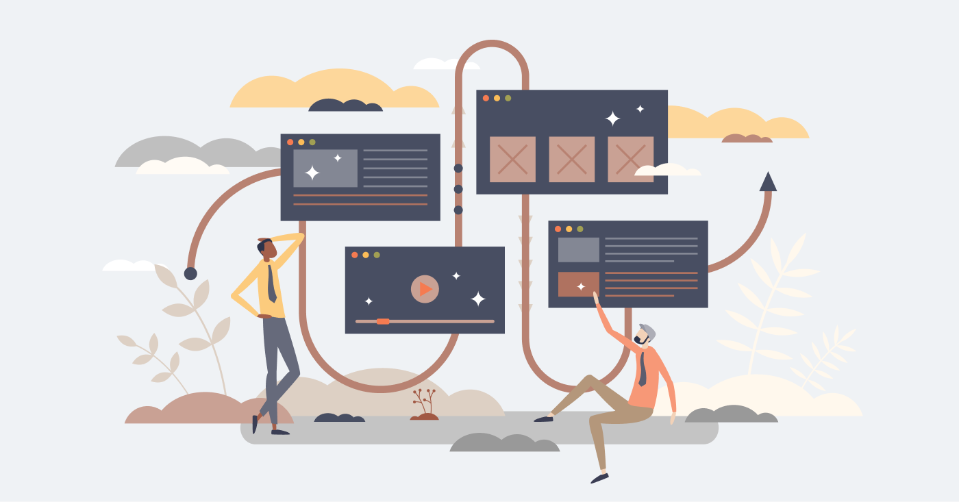
User flows, also known as user scripts or UX scripts, illustrate user journeys to complete a specific action and possible alternative outcomes. Visually, it looks as a mix of the classic flowcharts and interface elements. The purpose of the user flow is to help designers assess the purpose of each process that helps end-users complete their goals and, if needed, optimize them.
Visual interface design
6. Wireframes
Wireframes, or low-fidelity prototypes, are vital artifacts in UI/UX design. A wireframe represents the layout of the future mobile application or a website, but it's black and white, just like an architectural drawing.
7. Prototypes
Prototypes, or high-fidelity prototypes, are head and shoulders above plain wireframes. They're very similar to a final webpage or a mobile app and represent the final navigation, information architecture, and its look and feel. UI/UX designers use clickable prototypes to demonstrate their work to clients since they resemble a final product.
8. Mockups
A mockup is a full-size representation of your design that demonstrates it will look in the real life, for example, on a laptop or a mobile screen. The key difference between a mockup and a prototype is that a mockup is just a template that allows you to insert the product you're designing and show some part of it. Mockups are widely used for marketing purposes like presentations, pitch decks, and alike materials.
9. Design systems
A design system is a collection of rules, components, and tools that help UI/UX designers create new websites or mobile apps quickly and improve the quality of the existing product. It usually consists of guidelines, basic components like colors and typography, library of reusable components, design patterns, content guidelines, and branding principles.
10. Microcopy
Guess what: your text matters too! Microcopy, or UX writing, is the text you put on navigation elements like buttons, notifications, error messages, statuses, and so on. A well-chosen microcopy simplifies navigation and ultimately improves user experience. In large companies, the role of UX writer is dedicated, however, in smaller teams, UI/UX designers write microcopy themselves.
Understanding and producing the right deliverables at each stage of UI/UX design is crucial for creating effective and engaging digital products.

Conclusion
Understanding and producing the right deliverables at each stage of UI/UX design is crucial for creating effective and engaging digital products. By following the steps outlined in this guide, you can ensure a smoother design process and better user experiences.

FAQ
What are UX design deliverables?
UX design deliverables are tangible outputs created during the design process to communicate research insights, design decisions, and solutions. They help align stakeholders and guide development.
Why are UX deliverables important in product development?
Deliverables provide clarity, reduce misunderstandings, and ensure that design decisions are grounded in research. They serve as reference points throughout the project lifecycle.
What are the most common UX design deliverables?
Common deliverables include user personas, user journey maps, wireframes, prototypes, usability testing reports, information architecture, and design specifications.
How do UX deliverables support collaboration with developers?
Clear deliverables help developers understand user flows, interactions, and requirements. This reduces rework and speeds up implementation.
Do all projects require the same UX deliverables?
No, deliverables vary based on project scope, complexity, and goals. Designers should choose deliverables that provide the most value for each specific project.
How can UX designers prioritize deliverables effectively?
Designers should focus on deliverables that address key risks, validate assumptions, and support decision-making. Early collaboration with stakeholders helps prioritize what matters most.
Heading 1
Heading 2
Heading 3
Heading 4
Heading 5
Heading 6
Lorem ipsum dolor sit amet, consectetur adipiscing elit, sed do eiusmod tempor incididunt ut labore et dolore magna aliqua. Ut enim ad minim veniam, quis nostrud exercitation ullamco laboris nisi ut aliquip ex ea commodo consequat. Duis aute irure dolor in reprehenderit in voluptate velit esse cillum dolore eu fugiat nulla pariatur.
Block quote
Ordered list
- Item 1
- Item 2
- Item 3
Unordered list
- Item A
- Item B
- Item C
Bold text
Emphasis
Superscript
Subscript


